
- Home
- Layout
Layout
Layout theory
OU ICE layout is based around the 1em = approx 12px. The grid is flexible and true to the nature of the Dao of web design.
“... accepts the ebb and flow of things,
Nurtures them, but does not own them,”
Tao Te Ching; 2 Abstraction
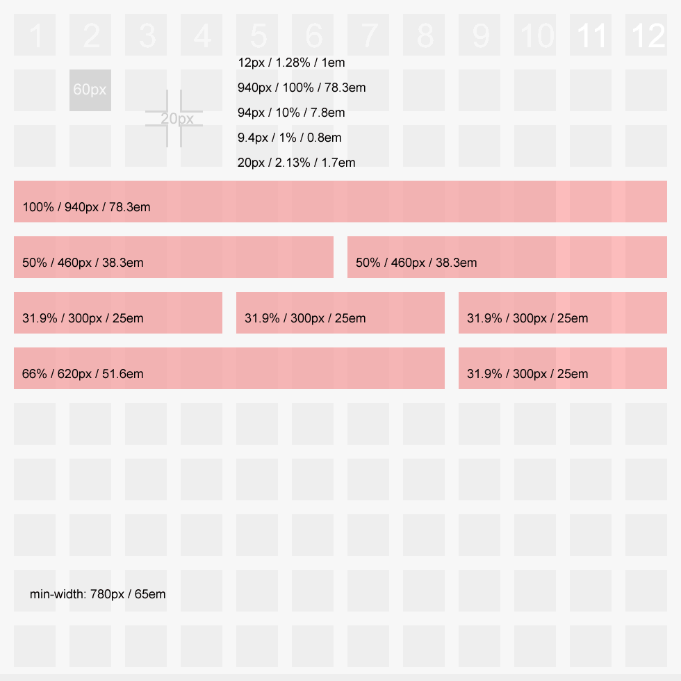
Recognising that designers like to work with a fixed canvas in Photoshop, a grid system is provided (click for bigger version):
Page layouts
- Plain and simple
- With site ident
- With creative
- With carousel
- With connected carousel
- With sections
- With site ident and sections
- With creative and sections
- With carousel and sections
- With connected carousel + sections
- Single column layout
- Three column layout
- Two sub-columns
- Three sub-columns
- Alignment
- Subtle
- Unboxed
- Left nav
Column layouts
A range of layout options are available:
- Standard layout (this page)
- Single column layout
- Three column layout
- Three cols, left nav
Region 1 Sub layouts
Alignment
See also: images
OU ICE tutorial
If you're new to OU ICE you might find this quick step by step tutorial useful.
OU ICE tutorial
If you're new to OU ICE you might find this quick step by step tutorial useful.